A Charts Consult
8 Pictures worth 1000 words each and more than 1500 actual words. That's 9500 in total -- more than you probably need!
Just a quick consult with some unrelated interesting charts covering a wide range of topics including hard data economic surprises, value stocks & the U.S. dollar, what GDPNow is suggesting, amazing technology labor productivity, a microcap surprise, no-show dividends, and a recession signal. I hope you find a few stimulating nuggets.
1. Hard Economic Data Now Slowing
The overall Citi U.S. Economic Surprise Index measures data surprises relative to market expectations. When the index rises, it implies that economic reports are stronger than expected while declines in the index suggest reports are worse than expected. When the index is highly positive, U.S. economic momentum has been strong whereas negative readings suggest economic growth has been slowing.
All year long, the Federal Reserve has been saying that although economic reports had been disappointing, the economic data that turned south was primarily “soft data” based only on surveys. “Hard economic reports” -- those derived from actually counting the number of widgets being produced in the factory rather than on opinions or feelings -- continued to remain healthy. The Fed told us there was no reason to ease monetary policy simply because pessimism had increased when hard data was still showing strength.
However, as shown in chart 1, since the end of May, “hard data” economic reports have also collapsed. Chart 1 overlays the Citi U.S. economic surprise index (blue line, left scale) with the components of the U.S. surprise index which are based solely on hard economic data reports (red line, right scale). The overall U.S. surprise index peaked last November near +50 and proceeded to decline to as low as -26 in late June. However, until early June, the “hard data” surprise index remained fairly strong. Indeed, it was still above +20 at the start of June. However, the hard data index has declined significantly during the last month. Consequently, the Fed’s case for “waiting because hard economic reports remain healthy” no longer holds water.
2. Value Stocks Have Been Battered by US Dollar Strength
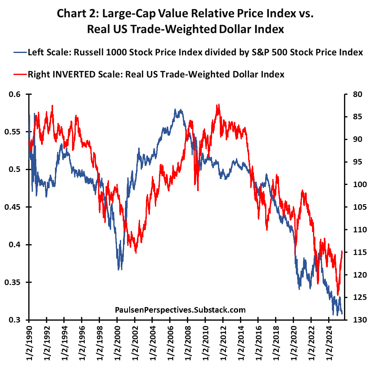
Investors have long struggled with the chronic underperformance of “value stocks”. As demonstrated in chart 2, the relative price of the Russell 1000 Value index peaked in 2006 – it’s been a long couple decades for value managers. As demonstrated, a big reason value has suffered for almost 20 years is because of remarkable strength in the U.S. dollar.
Chart 2 overlays the relative price of large cap value (blue line) with the real U.S. trade-weighted dollar index (red line, shown on an “inverted” right-side scale) since 1990. Using daily data since 1990, the correlation between the relative price of value stocks and the U.S. dollar is -0.66. Although, this is far from a perfect relationship, the dollar has traced out the major trend moves in the relative price of value stocks. In January, the real U.S. dollar rose to about 125, which was close to its all-time record high reached in March 1985. That is, during the last decade or so, the U.S. has arguably had one of the most contractionary dollar policies in history. This has helped depress commodity prices and reduce the competitive position of U.S. companies, many of which have been value stocks.
The good news is dollar strength may be ending. Since its January high, the real dollar has declined by about 10%. If this new trend of dollar weakness persists (it could be further supported by ongoing U.S. economic growth weakness and by a possible Fed easing), perhaps value stocks will finally become a market leader for a period?
Keep reading with a 7-day free trial
Subscribe to Paulsen Perspectives to keep reading this post and get 7 days of free access to the full post archives.


